Our Masterbrand Logo
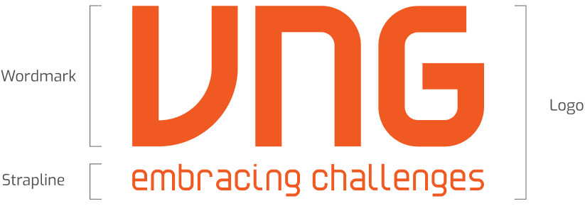
The VNG logo= Wordmark + Strapline
There are two components to the VNG logo:
- The Wordmark
- The Strapline
The Wordmark and the Strapline should always be laid out exactly as the example here. To ensure this, please apply approved digital art files only.
Our Masterbrand Logo: The Lock-Ups
The VNG logo is designed in a variety of lock-up formats to suit dierent applications.
Stacked version
This is our primary version- it is our preferred logo and should be used whenever possible.
Single line version and simplified version
This version can be used when design space is limited, such as:
- Merchandise with space limitations
- Building signage
- Events and situations when non-standard space issues may arise
Stacked version:
The preferred version
Single line version
Simplified version
Our Masterbrand Logo: Clear Space
Make sure the logo is visible by keeping clear space all around it, free from other texts and graphics. Find the examples on the right to see how much space you need to leave as the minimum requirements.
One-third of the width of the letter “V” in the Wordmark is used as the unit of measurement defining clear space around all versions of the Wordmark. It is defined as X.
This is an important measurement and is the basis upon which all other measurements in these guidelines are derived. For example, the gap between letters in the Wordmark is exactly 2X.
The same clear space measurement can be applied to single line version and simplified version of our logo.
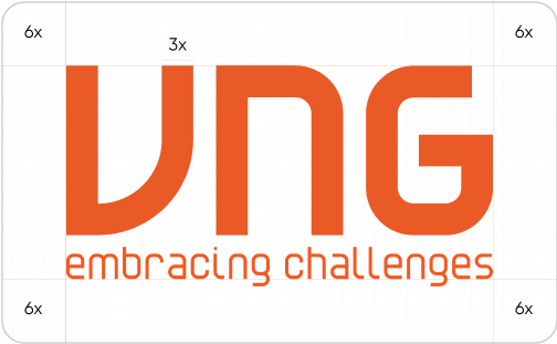
Stacked version:
The preferred version
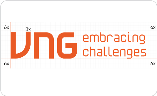
Single line version
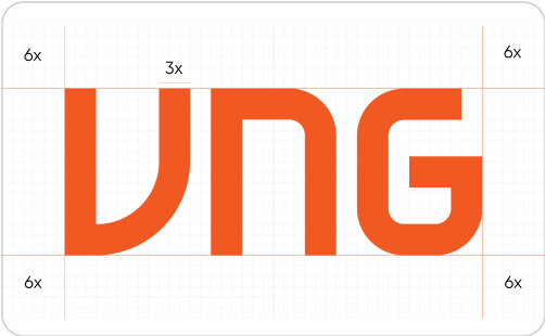
Simplified version
Our Masterbrand Logo: Minumum Size
This page shows minimum sizes for logo reproduction.
For exceptional circumstances where you need to create a logo that is smaller than the minimum sizes, please contact the CBC team for further support.
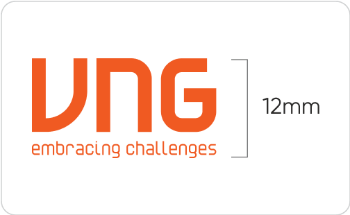
Stacked version:
The preferred version
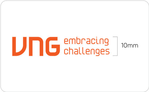
Single line version
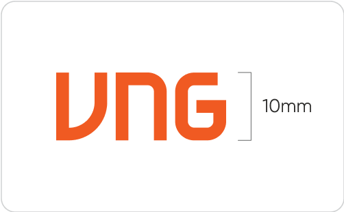
Simplified version
Our Masterbrand Logo: Dos and Don’ts
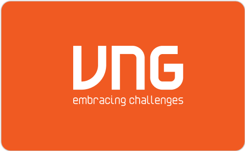
Communication materials should always use the full-color logo whenever possible.
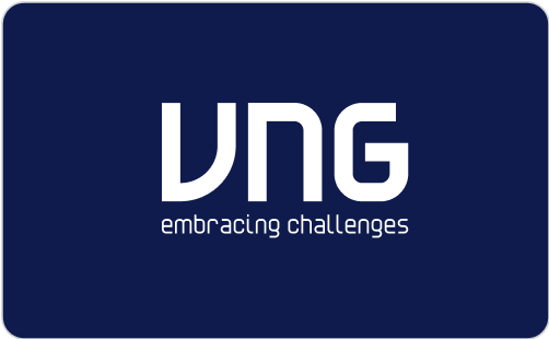
Mono-colored versions can be used when necessary.
To avoid mistakes when using the VNG logo, please only use the digital artwork available on the VNG website at vng.com.vn.
To ensure consistent brand recognition and integrity, please examine the Dos and Don'ts on the right.
Further requests to access artwork, please contact the CBC team.
Good examples: Full colour and mono colour

What to avoid
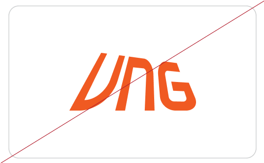
Don’t stretch or condense the logo
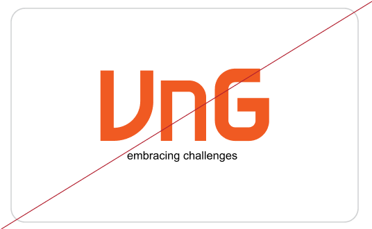
Don’t modify our logo and/or strapline design and typography
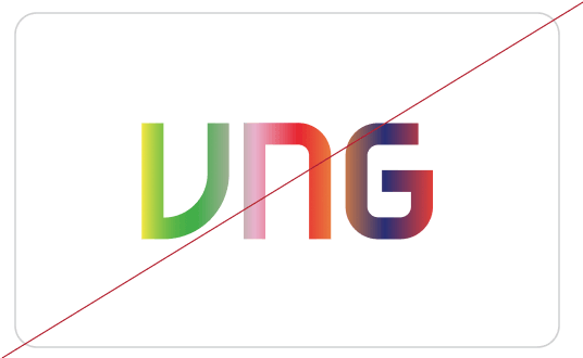
Don’t change
the color of the logo
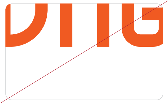
Don’t present the logo in a cropped composition
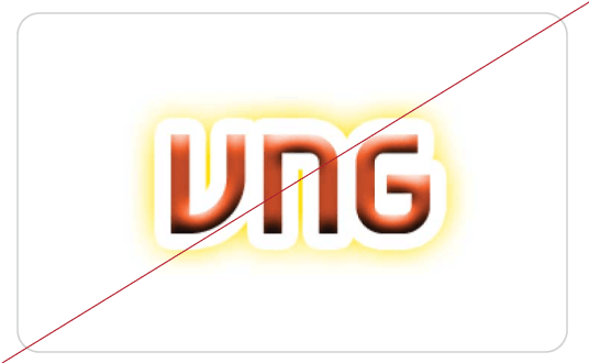
Do not apply graphic stylization and special effects on our logo
Do not apply different color combinations
Our Masterbrand Logo: Artwork
Good examples: Full colour and mono colour


Single line version
Simplified version
